Wednesday, August 13, 2014
bathroom test 3D
http://www.ziddu.com/register.php?referralid=(yOvjvm~@L.
http://downloads.ziddu.com/download/23970269/bathroo.jpg.html
http://WeeklyYouthPay.com/?ref=217191
http://adf.ly/r6BJE
http://adf.ly/?id=7544342
Thursday, August 7, 2014
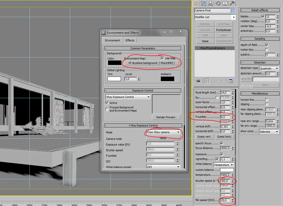
How to use VRayPhysicalCamera
This tutorial show you the example function of vrayphysical cam.
Example 1: exposure control - f-number (f-stop)
This parameter controls the aperture size of the virtual camera. Lowering the f-number value increases the aperture size and so makes the image brighter, since more light enters the camera. In reverse, increasing the f-number makes the image darker, as the aperture is closed. This parameter also determines the amount of the DOF effect, see Example 9.Exposure is on, Shutter speed is 60.0, ISO is 200, Vignetting is on, White balance is white.


Example 2: exposure control - Shutter speed
This parameter determines the exposure time for the virtual camera. The longer this time is (small Shutter speedvalue), the brighter the image would be. In reverese - if the exposure time is shorter (high Shutter speed value), the image would get darker. This parameter also affects the motion blur effect, see Example 10.Exposure is on, f-number is 8.0, ISO is 200, Vignetting is on, White balance is white.


Example 3: Exposure control: film speed (ISO )
This parameter determines the sensitivity of the film and so the brightness of the image. If the film speed (ISO) is high (film is more sensitive to the light), the image is brighter. Lower ISO values mean that the film is less sensitive and produces a darker image.Exposure is on, Shutter Speed is 60.0, f-number is 8.0, Vignetting is on, White balance is white.


Example 4: Zoom factor
This parameter determines the zooming (In and Out) of the final image. It doesn't move the camera forward nor backwards.Exposure is on, f-number is 8.0, Shutter speed is 60.0, ISO is 200.0, Vignetting is on, White balance iswhite


Example 5: Vertical shift (Camera Correction)
Using this parameter you can archive the so called "2 point perspective". To have that done automatically, use the button.


Example 6: Distortion
The difference between the two types of distortion is slightly visible. The Cubic type should be used in some camera tracking programs like SynthEyes, Boujou etc.


Example 7: Vignetting
This parameter controls the simulating the optical vignetting effect of real-world cameras.


Example 8: White balance
Using the white balance color allows additional modification of the image output. Objects in the scene that have the specified color will appear white in the image. E.g. for daylight scenes this should be peach color to compensate for the color of the sun light etc.Exposure is on, f-number is 8.0, Shutter speed is 200.0, ISO is 200.0, Vignetting is on


Example 9: Depth Of Field (DOF)
To enable the DOF effect you need to turn on the Depth-of-field option in the Sampling rollout of the physical camera. The effect is most strongly seen when the camera is close to some object, like when doing a "macro" photo. For a strong DOF effect, the camera aperture must be open wide (i.e. small f-number value). That may lead to a very burnt and bright image, so to preserve the same illuminosity over the whole image, the shutter speed must shortened. And at last but not at least the focus distance determines which part of the scene will be actually on focus. To get the focus near, you would need a small value and reverse - higher value for far focus.Exposure is on, f-number is 1.0, Shutter speed is 4000.0, ISO is 200.0, Vignetting is on


Example 10: Motion Blur (MB)
To enable the motion blur effect you need to turn on the Motion blur checkbox in the Sampling rollout of the physical camera. The amount of the motion blur is determined by the speed of the moving object itself as well as the Shutter speed setting of the camera. Long shutter speeds will produce more motion blur, as the movement of the object is tracked over a longer in time. In reverse, short shutter speeds will produce less motion blur effect. Keep in mind that to preserve the same illuminosity over the whole image, the f-number value has to be corrected as well.Note that in the example the far object is moving quicker than the near one, which cases the difference in the motion blur effects.Exposure is on, ISO is 200.0, Vignetting is on


Basic learning about VraySun and VraySky in 3D Max
VraySun and VraySky
The VRaySun and VRaySky are special features which are provided by the V-Ray renderer. Developed to work together, the VRaySun and VRaySky reproduce the real-life Sun and Sky environment of the Earth. Both are coded so that they change their appearance depending on the direction of the VRaySun.
VRaySun parameters
The VRaySun is located in the (Create - Lights - VRay) panel.You can also specify the VRaySun as the sun type inside a 3ds Max Daylight system.
Enabled - turns on and off the sun light.Invisible - when on, this option makes the sun invisible, both to the camera and to reflections. This is useful to prevent bright speckles on glossy surfaces where a ray with low probability hits the extremely bright sun disk.Turbidity - this parameter determines the amount of dust in the air and affects the color of the sun and sky. Smaller values produce a clear and blue sky and sun as you get in the country, while larger values make them yellow and orange as, for example, in a big city.Ozone - this parameter affects the color of the sun light. Available in the range between 0.0 and 1.0. Smaller values make the sunlight more yellow, larger values make it blue.Intensity multiplier - this is an intensity multiplier for the VRaySun. Since the sun is very bright by default, you can use this parameter to reduce its effect.Size multiplier - this parameter controls the visible size of the sun. This affects the appearance of the sun disc as seen by the camera and reflections, as well as the blurriness of the sun shadows.Shadow subdivs - this controls the number of samples for the area shadow of the sun. More subdivs produce area shadows with better quality but render slower.Shadow bias - moves the shadow toward or away from the shadow-casting object (or objects). If the bias value is too low, shadows can "leak" through places they shouldn't, produce moire patterns or making out-of-place dark areas on meshes. If bias is too high, shadows can "detach" from an object. If the bias value is too extreme in either direction, shadows might not be rendered at all.Photon emit radius - determines the radius of the area, in where photons would be shot. This area is represented by the green cyllinder around the Sun's ray vector. This parameter has effect when photons are used in the GI solutions or caustics.
Sky Model - Allows you to specify the procedural model that will be used to generate the VRaySky texture.- Preetham et al. - when this mode is selected the VRaySky procedural texture will be generated based on the Preetham et al. method.
- CIE Clear - when this mode is selected the VRaySky procedural texture will be generated based on the CIE method for clear sky.
- CIE Overcast - when this mode is selected the VRaySky procedural texture will be generated based on the CIE method for cloudy skyIndirect horiz. illum. - specifies the intensity (in lx) of the illumination on horizontal surfaces coming from the skyExclude - this button allows you to exclude objects from illumination/shadow casting for the sun light.
VRaySky parameters
The VRaySky texture map is typically used as an environment map, either in the 3dsmaxEnvironment dialog, or in one of the slots of the V-Ray Environment rollout and behaves very much like a HDRI environment map. The VRaySkychanges its appearance based on the position of the VRaySun.
Manual sun node - specifies how the VRaySkydetemines its parameters:Off - the VRaySky will automatically take its parameters from the first enabled VRaySun in the scene. In this case, none of the other parameters of VRaySky are accessible.On - you can choose a different light source. It is recommended that you choose only direct lights, as the vector for the direction is taken into consideration when computing the appearance of the sky. In that case theVRaySun is no longer controlling the VRaySky and the parameters in the texture map rollout determine the final look of the sky.Sun node - specifies which light source is chosen if Specify sun node is On.Sun turbidity - refer to VRaySun parametersSun ozone - refer to VRaySun parametersSun intensity multiplier - refer to VRaySun parametersSun size multiplier - refer to VRaySun parametersSun invisible - when this option is on, the sun disk will not be visible on the sky texture.
Sky Model - Allows you to specify the procedural model that will be used to generate the VRaySky texture.- Preetham et al. - when this mode is selected the VRaySky procedural texture will be generated based on the Preetham et al. method.
- CIE Clear - when this mode is selected the VRaySky procedural texture will be generated based on the CIE method for clear sky.
- CIE Overcast - when this mode is selected the VRaySky procedural texture will be generated based on the CIE method for cloudy skyIndirect horiz. illum. - specifies the intensity (in lx) of the illumination on horizontal surfaces coming from the sky
Notes
- By default, the VRaySun and VRaySky are very bright. In the real world, the average solar irradiance is about 1000 W/m^2. Since the image output in V-Ray is in W/m^2/sr, you will typically find that the average RGB values produces by the sun and the sky are about 200.0-300.0 units. This is quite correct from a physical point of view, but is not enough for a nice image. You can either use Color mapping to bring these values to a smaller range (which is the preferred way) or you can use the Sun intensity multiplier to make the sun and sky less bright. Using the VRayPhysicalCamera with suitable values also produces a correct result without changing the sun and sky parameters.
this tutorial for change the colour of your 3dMax
that was easy way to change the interface colour of 3d studio max 2010 is by simply opening the "customize" drop down list at the top and selecting the first one on it "Customize User Interface" when the screen opens simply go to the "colour" drop down and this lets you shange the colour for every little aspect of the program.
many option for the colour changes, so try it now and get what colour for your 3dmax theme.
many option for the colour changes, so try it now and get what colour for your 3dmax theme.
Wednesday, August 6, 2014
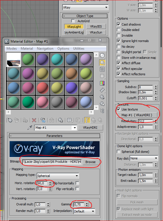
Exterior lighting with HDRI
The VP HDRI Skydomes have a very high dynamic range, which is best to create sharp sun shadows. Also they have an accurate white balance that will bring convincing and colorful lighting into your scene with a few clicks.
Basically you just need to follow 2 main steps: First to create a vray light dome and second to create a vray physical camera with proper exposure settings.
Until this point, we have created our light system, in the next point we will treat the camera settings. Before we move onto the next point, let’s speak about the gamma setting. This setting allows colors to have more punch and contrast, in an high dynamic range context it means that bright spots are much brighter than normal, therefore creating sharper and stronger shadows. You can decrease this value if you feel the light is a bit too flat to bring more contrasts, or increase it if the light gets too harsh.

There are basically two things we want to achieve when setting up the camera: a proper exposure, and an adequate white balance.
If you want to use the same hdri skydome for the background, you can just add the same map to the environment slot of the render Environment Map. If you can´t match the background with the lighting of the vray domelight, you can also create a second copy of the vrayHDRI map with different settings and split these two.
Setting up the white balance :
Using the temperature option is probably the easiest as you can directly change a value and get a cooler or warmer result. For most of conditions, a value ranging from 4500 to 6500 should give you best results. You can always use the eyedropper of the Vray Frame Buffer to see whether a supposed white area is too blue or too red and adjust the temperature according. If it is too warm one must decrease the value, and oppositedly if it is too cold one must increase the value.
Also, sometimes having white areas looking blueish or reddish can lead to a better overall result and is dependant on the mood you try to achieve !
Friday, October 26, 2012
learning about materials, just copas :p
VRayMtl is the basic, most used, universal material that VRay offers. You will find that most of the materials you wish to create can be made from a VRayMtl.
This how the basic, unchanged material looks.

Now let’s look at the first section – Diffuse.
Think of Diffuse as the base color of the object. If you see a tomato, you can instantly tell it’s red. This means that red is the Diffuse color. It is a bit more complicated for very reflective or very refractive objects, but we will look at those later.
VRayMtl allows you to choose a simple color as the Diffuse or use a Map. You can use any Bitmap or Procedural Map in the Map slot.
Here is an example.

The Roughness parameter can “flatten” the color transitions. You can use it to make your material appear dusty and flat. Here is an example with the same green material at 0, 0.5 and 1.0 Roughness.

Next section is Reflection

As the name suggests, this section deals with the reflective properties of the material. Most real world objects are reflective. Look at these photos of chrome and brick for example.

The reflections of the chrome are very strong and sharp, you can instantly recognize it as a reflective surface. But what about the brick? It might look that it’s not reflective at all, but in fact the reflections are just weak and very very blurred. The only objects that don’t reflect any light are the black holes  Keep this in mind when creating the materials.
Let’s look at the parameters now.
First is the Reflection color.

Black color makes the material non-reflective, white color makes it fully reflective. All the gray scale values between increase or decrease the reflection strength. The color sliders in 3Ds Max go from 0 to 255, this means that if you want to make a material that reflects 50% of the light that hits it, you need to set the value of the reflections to 128. Here is an example at 0, 128 and 255. Notice how the third image has lost all the Diffuse color and is only showing the reflections. Reflections make the base color weaker as they get stronger. The Energy Preservation law doesn’t allow realistic materials to reflect more light than they receive. This means that If the material has 0% reflections, it shows 100% of the Diffuse color. If the material has 30% reflections, the Diffuse color is weakened to just 70%, and so on. Think of the reflections as a layer on top of the Diffuse, together they create the final image.

Just like with the Diffuse, you can use Color, Bitmap or Procedural map in the Reflect slot. Here is an example with all three.

The Diffuse color for all the examples is 128 gray. Notice how the Reflect color changes the look of the Diffuse. This color change happens because VRay adheres to the Energy Preservation rule. If the material reflects the red colored light, the red color is subtracted from the Diffuse and only green and blue are left. This behavior can sometimes make it difficult to predict the final result, this is why you can change the Energy Preservation mode in the material options. If you choose Monochrome, only the reflections will be colored and the Diffuse color will be left unchanged.


Next up is Reflection Glossiness. This is the parameter that controls how sharp/blurred are the reflections. Some real world objects, like polished metal, mirror, chrome, have very sharp reflections, while other materials, such as wood, concrete, plastic, etc., have blurred reflections. You can adjust the Reflection glossiness from 0 to 1 (completely blurred to perfectly sharp). For most materials you will not need to lower the glossiness below 0.3. You should always use blurred reflections with caution, do not lower the glossiness more than necessary, as this will cause more noise in your image, you can get rid of it by increasing the Subdivs, but it will take a toll on the rendertime. Here are some basic examples of how the glossiness works.

Notice the noise introduced into the image. You can clean it up with the Subdivs parameter, increasing it will make reflections smoother at the cost of render time. Notice how the render time has increased 3.5 times if you compare the third and first images. 16 is a good choice for decent result without too much waiting. You can use the subdivs parameter to find a balance between time and quality.

I do not recommend unlocking Highlight glossiness and changing it, if your goal is realistic materials. This parameter allows you to ‘fake’ the blurred reflections without actually calculating them. It can sometimes be used for quicker renders if deadlines are tight.
Next up is the Fresnel parameter. You might have heard that all real world materials feature Fresnel reflections, but what does it actually mean? Fresnel changes the reflection strength depending on the viewing angle. General rule is that reflections are weaker if the surface is facing you perpendicularly and increase in strength as the surface approaches parallel position relative to your viewing angle. Here are some real world examples where you can see this effect in action. The marble, car and wall surfaces are much more reflective when they are more parallel to the viewing angle.

And here is how the Fresnel IOR or Index of Refraction works. Use only values from 1.01 up, lower values are not physically correct for normal materials. Increasing the IOR changes the relationship between the angle of the surface and reflection strength, look at the examples.

As a general guideline, here are the Reflect IOR values for some common object types:
water 1.33
plastic 1.45
glass 1.5-1.8
diamond 2.4
compound materials like wood, stone, concrete etc 3-6
metals 20-100
plastic 1.45
glass 1.5-1.8
diamond 2.4
compound materials like wood, stone, concrete etc 3-6
metals 20-100
Exact values need to be fine tuned for each material to achieve the right look.
Next parameter is Reflection Depth. This is the number of times a light ray is reflected before stopping the calculations. When the set number of reflections has been calculated, the rest are simply displayed as the Exit color. You can try setting a bright color as the Exit color to see how much information you lose. Look at the example, the green parts show the areas which would benefit from a larger number of reflections. As you can see, 6 reflections are plenty for this scene. Other scenes with more reflective surfaces might need a larger value.

Let’s move on to the next section – Refractions
These settings control if and how the material let’s the light through it. Common materials that have refractive properties are glass, water, gems, transparent plastics, etc.
First parameter that controls the refractions is Refract color. As before, it goes from black (no refractions) to white (full refractions) and everything in between is a mix between Diffuse and Refraction.
Here are some examples with a black material. I recommend using black diffuse color [1;1;1] for most of the transparent materials and adjust the overall color with Refract color and Fog color.

You can use a color, bitmap or procedural map in this slot as well.

Refraction glossiness. Just like with the reflections, you can change how blurry are the refractions. This effect is great for frosted glass or any other rough surface that lets through the light but distorts it along the way.
This one increases render times and noise a lot so be careful with it. No need to go lower than 0.6 for most materials.

To clean up the noise, we need to increase Subdivs parameter. As you can see, getting a clean result comes with a huge cost. The render time for the last image is almost 7 times longer than with the default value. It is also 15 times longer than not using blurred refractions at all! So try to minimize the blurred refractions if you need fast renders.

In the real world light changes it’s angle as it travels between objects of different density, thus the surface ‘refracts’ the light. IOR value of 1 let’s the light through without bending it, as the IOR value increases, so does the angle at which light is refracted. Look at these examples.

Index of Refraction has been calculated for many materials, so you don’t need to guess. You can find various IOR tables on the internet. Here is one of them:
Acetone 1.36
Actinolite 1.618
Agalmatoite 1.550
Agate 1.544
Agate, Moss 1.540
Air 1.0002926
Alcohol 1.329
Amber 1.546
Amethyst 1.544
Crystal 2.00
Diamond 2.417
Emerald 1.576
Ethanol 1.36
Ethyl Alcohol 1.36
Glass 1.51714
Glass, Albite 1.4890
Glass, Crown 1.520
Glass, Crown, Zinc 1.517
Glass, Flint, Dense 1.66
Glass, Flint, Heaviest 1.89
Glass, Flint, Heavy 1.65548
Glass, Flint, Lanthanum 1.80
Glass, Flint, Light 1.58038
Glass, Flint, Medium 1.62725
Gold 0.47
Ice 1.309
Ivory 1.540
Jade, Nephrite 1.610
Jadeite 1.665
Lead 2.01
Malachite 1.655
Methanol 1.329
Moonstone, Albite 1.535
Nylon 1.53
Onyx 1.486
Opal 1.450
Oxygen (gas) 1.000276
Oxygen (liq) 1.221
Pearl 1.530
Plastic 1.460
Plexiglas 1.50
Polystyrene 1.55
Quartz 1.544
Quartz, Fused 1.45843
Rock Salt 1.544
Rubber, Natural 1.5191
Ruby 1.760
Sapphire 1.760
Silicon 4.24
Steel 2.50
Tiger eye 1.544
Topaz 1.620
Tourmaline 1.624
Turpentine 1.472
Turquoise 1.610
Water (gas) 1.000261
Water 35′C (Room temp) 1.33157
Zirconia, Cubic 2.170
Max depth works just like with the reflections. The default value is usually fine, but for scenes with large amount of refractions, you should increase it.
Next parameter is Fog Color. It is great if you want to tint the glass in a realistic way. Using the Fog color makes thinner parts lighter and thicker parts darker. You can use the Fog multiplier value to adjust how strong is the tint. I suggest using colors with less than 255 lightness and saturation for realistic results.

You can control the relationship between object thickness and Fog intensity by using the Fog Bias value. Look at the examples to see how it works. Negative values make the tinting stronger and color transitions more extreme, while positive values make the fog smoother and weaker. Use it together with fog multiplier to get the effect you need.

The biggest drawback of the Fog color is that you can not use a map in this slot, this means you can only use a single color. If you want to create a stained glass material or glass with multiple colors, you will have to do that by using the Refract color and not the Fog. It is, however, great for those single-colored materials and much more realistic than simply changing the Refract color.
VRay 2.0 introduced the long awaited Dispersion feature for refractive materials, until 2.0 you had to use a ‘fake’ method of blending multiple materials with different Refract colors and IOR. Now you can simple activate the Dispersion and change the strength with Abbe number. Smaller values makes the dispersions stronger, while larger numbers makes them more subtle. Use your own artistic eye to figure out how much dispersions you need. You will have to increase the Refract Subdivs for a nice result (with the default value materials have a green tint), even if you are not using glossy refractions. Dispersion also increases the render time.

Next section is Translucency, but we are going to skip it, as I prefer to use VRayFastSSS2 material for translucent objects. It offers much greater speed and flexibility.
Let’s look at the BRDF section.

First is the BRDF model. This parameter affects how the specular highlights of the material are calculated. VRay offers 3 options: Phong, Blinn and Ward. Phong has the sharpest highlights, Blinn is a bit more blurred and Ward is even softer. Blinn is the default value and it is fine for most materials, for metals you will want to use the Ward model.

Anisotropy allows you to create stretched highlights. In real world these are most commonly seen on brushed metal surfaces with long, parallel ‘scratches’. Anisotropy allows you to fake this by stretching and rotating the highlights as you like.
This example shows how changing the Anisotropy value changes the speculars. Negative values stretch them highlights horizontally while positive values stretch them vertically.

You can also change the angle manually to any value you need. Here is an example with stretching rotated at 45 degrees.

And finally you can change the reference axis for even more control.

Next comes the Maps section of the material. This is a convenient list of all the slots you can assign bitmaps or procedural maps to.

There are some important properties of the material that can only be accessed through this section. These are Bump, Displace and Opacity.
Let’s look at the Bump and Displace slots first.
Both of these slots allow you to assign a bitmap or procedural map to simulate unevenness and deformation of the objects surface. Bump does so without changing the overall geometry of the object, but Displace actually subdivides and deforms the object during rendering. The deformations work like this – middle grey [128;128;128] of the map does not change anything on the object, darker values push the surface inwards while lighter values pull it out. The further this value is from medium gray, the stronger is the effect. Color of the map is not taken into account and only the lightness value is used.
Bump is fast and Displace is slow.
If you need large, realistic deformations, you should use displacement, while bump is perfect for smaller things that don’t change the objects outline. Look at the examples to see the difference.

Last map we are going to look at is the Opacity map. It works very simple. Pure white value is used for the non-transparent parts of the material and pure black is for completely invisible parts of the material, everything in between is more or less half transparent. It is great if you need to simulate stuff like tree leaves or lace fabric without using a large amount of polygons. Here is an example using the same map as in the Bump samples.

The two next segments of VRayMtl are Reflect Interpolation and Refract Interpolation. They are supposed to be a quicker way for calculating blurred reflections and refractions, but I will not be covering those, as I have often found troubleshooting the issues/glitches that can appear from them take longer time than rendering non-interpolated materials.
This wraps up the basic VRayMtl, it already allows you to create 90% of the materials you will encounter in your work. There are, however, some special cases where other materials are better suited.
Let’s look at the VRayBlendMtl. It is the perfect tool for making compound materials.For example, if you need to create a black, shiny surface with blurred gold spots, it is way easier to create two materials and blend them together than hand painting all the different maps you would need to achieve this effect in a single VRayMtl.
The VRayBlendMtl works with a layer-like system.
There is a Base material to which you can apply multiple Coat materials. You can control how much of the coat material is applied by using Blend Amount color, Bitmap or Procedural map. Pure white blend color shows only the coat material, medium gray shows 50% of the coat material and 50% of the base material and finally pure black doesn’t show any coat material at all.

Here is the same blend material with black and white checker map in the Blend Amount slot.

Each next coat layer treats everything above it as a single material, if you have a base material and 2 coat materials at 50%, the result is 0.5(0.5base+0.5_1st_coat)+0.5_2nd_coat.
In this example I’ve added a second coat layer with pure green diffuse color, if all 3 parts would be used equally, the resulting color should be white (RGB at equal values result in grayscale color), but it is instead a 50/50 mix of purple and green.

You can use up to 10 material in a blend (if you then create a new VRayBlendMtl and keep the filled one as sub-material, you can add 9 more materials, repeating this procedure gives you unlimited amount of slots). Here is a somewhat more complex example of a 4 material blend.

I am sure you now see the potential of VRayBlendMtl. I will show you some practical examples on how to use it in the videos.
Let’s move on to the next material type – VRayFastSSS2. The letters SSS stand for Sub-Surface Scattering, another common name is Translucency. This effect happens when light rays don’t go straight through the object, but are scattered in multiple directions when inside, this does not allow you to see through the object, but you can see the light inside it. Unlike refraction glossiness which scatters light rays at the surface, SSS does this inside the object. This makes some interesting lighting effects, the light penetrates the object and lights it from within. Some real world examples are: flesh, milk, marble, jade, fruit, wax etc. Look at these photos to see what I’m talking about.

VRayfastSSS2 is perfect for this type of materials.
My example scene for this section has just one light behind he object to illustrate the sss effects better.
Compare the VRaymtl and VRayfastSSS2. Notice how the regular material doesn’t let any light in, only bounces it off the surface while VRayfastSSS2 is more illuminated. The effect is very subtle though.

The easiest way to increase the translucency effect, is by increasing the Scale setting. The larger the Scale, the deeper light goes into the object.

Next parameter, SSS prepass, controls the accuracy of the scattered light. Lower values give blurrier results, while higher values give a more precise rendering, the precision comes with an increased render time. For production renders, I suggest using values of -1 to 1.

Fast SSS allows you to set the IOR as well. Most water based materials like skin, milk, juice, plants have IOR of ~1.3, for stone type materials 1.5-1.7 is more suitable.
You can also use the built-in presets to quickly create some common materials, these are:
Skin (brown)
Skin (pink)
Skin (yellow)
Milk (skimmed)
Milk (whole)
Marble (white)
Ketchup
Cream
Potato
Spectralon
Water (clear)
Skin (pink)
Skin (yellow)
Milk (skimmed)
Milk (whole)
Marble (white)
Ketchup
Cream
Potato
Spectralon
Water (clear)
If none of the presets fits, you can create the material yourself.
Let’s look at the settings.
First is the Overall color. This color allows you to change the color of the whole material (the surface and the inside).
Look at the examples to see how this color changes the look of the default VRayfastSSS2 material.

Next is the Diffuse color and Sub-Surface color. First one controls the outer surface, second one controls the inside of the object. This works somewhat different than VRaymtl. By default, VRayfastSSS2 only uses the sub-surface color and scatter color as the main sources of pigment. You can assign a diffuse color and increase the diffuse amount to mix it with those two colors. It is a bit hard to explain, I’ll show you an example. Here I have assigned a Red Diffuse color and a Blue sub-surface color. With the default setting of 0 Diffuse is not seen at all, when I increase it to 0.5 it is a 50% mix with the blue and finally, when I set it at 1, there is no more translucency and only the red diffuse color is seen.

Ok, let’s look at the Scatter color now. The lightness of this color affects how strong is the scattering effect. It get’s stronger from black to white, as usual.
I’m using a simple grey material with red sub-surface color in this example.

You can also use a saturated color in this slot to give a tint to the object. It work’s best if you use a color that is close to the sub-surface color. It also tints in the opposite direction, sounds weird, I know. What it means is if your sub-surface color is red and you set the scatter color as orange, the actual tint will be to the opposite direction of the hue scale – purple. If you use purple, the tint will be orange. Look at the pictures to see it in action. The effect is subtle, but sometimes it’s just what is needed!

Scatter Radius works just like Scale, you can increase the depth of translucency by increasing this value.
Let’s look at the Specular Layer now.
You can make the VRayfastSSS2 material reflective by enabling Trace Reflections option. You can control the look of the highlights just like with the VRaymtl – by changing the glossiness value.
All these settings – glossiness, subdivs, reflection depth work just like in the basic VRaymtl.

Let’s move on to the Options section.
The main setting here you need to focus your attention is Single Scatter mode.
There are 3 possibilities you should use depending on the material you are trying to create.
Simple mode is best for materials where the light doesn’t go too deep, best examples are skin, plastic.
Refractive mode is great for materials that are very translucent but at the same time quite opaque (marble, milk)
Refractive (raytraced) mode is for more transparent materials, this also creates nice refractions and transparent shadows. Use it for materials like glass, water, crystals.

For the best results, turn Front lighting, Back lighting and Scatter GI on.
Subscribe to:
Posts (Atom)